YO! Boxpark Branding
YO! was looking to create an impact with its Boxpark restaurant launch, which set itself apart from the main brand with its quirky street food menu.
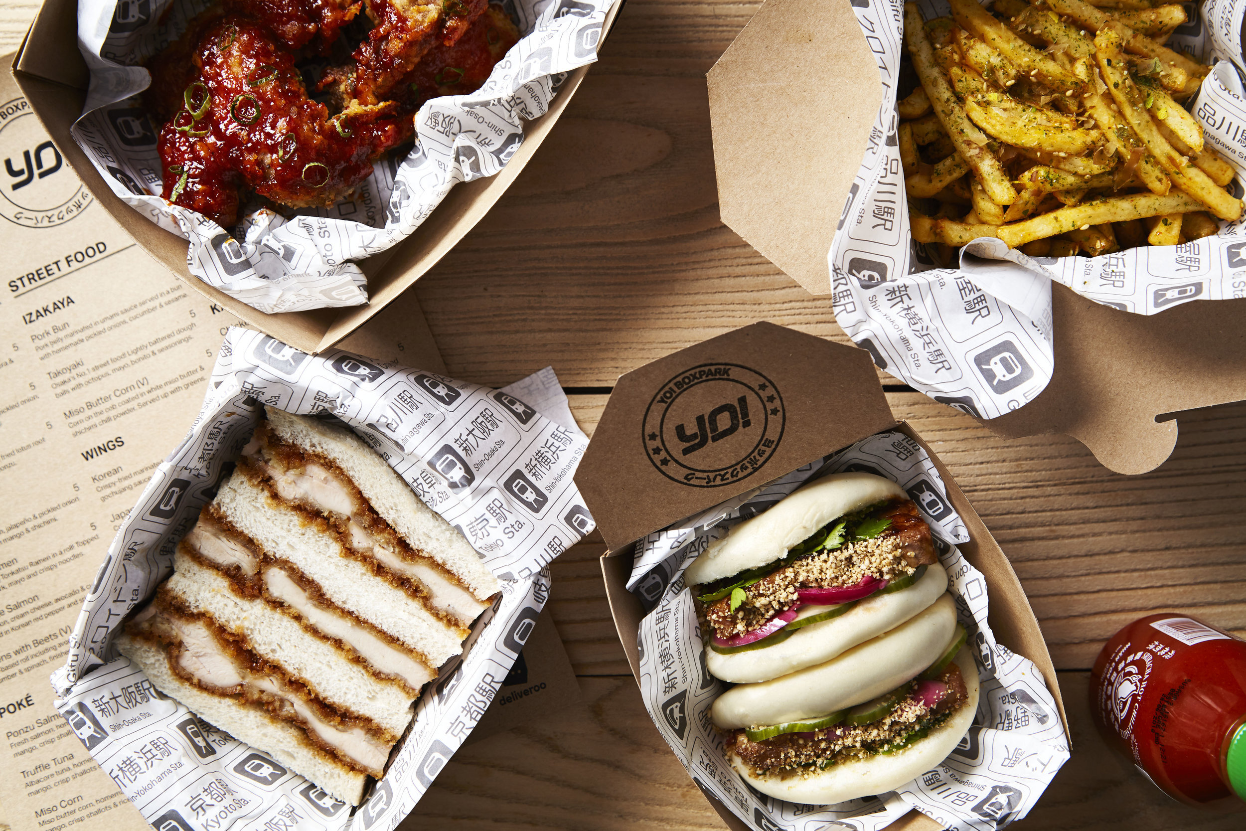
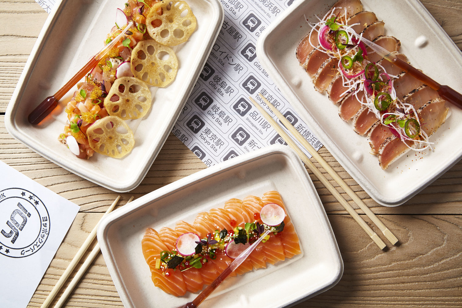
Tasked with creating its branding, I looked at the origins of the food, which was inspired by Japanese bentou found on bullet trains in Tokyo.I created a stamp style logo to mimic the stamps you can collect from any Japanese train station. Each bullet train station features within the packaging pattern, a nod back to the origins of YO!.
The menu is printed on recycled brown paper to compliment the look and feel of YO! Boxpark.


